
Is Knack Interface Old Fashioned? Not Any More With These Easy Upgrades!
Hello Folks!
Perhaps many times we can focus on the functionality of the application in Knack. That all the requirements, buttons, boxes, text fields and pagination do what they’re supposed to do.
However, they don't need to look old fashioned or boring, right?
As web architectures we must always strive for a great functional and solid design in all our creations. This should be a combination of technology and human intuition to produce exceptional work which originally was not intended in that way. We have the ability to deliver completely superior work that exceeds the expectations of our clients and colleagues.
This is why we want to show how to convert a basic looking page into a styled pro looking one.
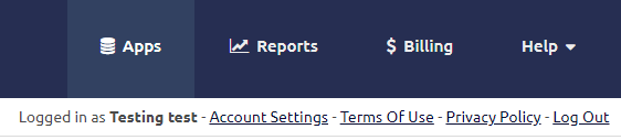
Just follow these steps and you’ll be able to transform this:

Into a professional look and feel page like this:

What do you have to do?
Step 1:
Customize logo size with CSS
#kn-app-header #knack-logo{
 padding: 15px 0px;
}
#kn-app-header #knack-logo img {
   height: 60px !important;

Step 2:
Change tab navigation into top right buttons
#knack-body #kn-app-header{
  background-color: #194f69;
}
header .kn-container {
   align-items: center;
   display: flex;
   justify-content: space-between;
}
.kn-content .kn-navigation-bar nav {
   padding-left: 20px;
}
#kn-app-menu nav.tabs li.is-active a {
   color: #FFF !important;
   background-color: #3c7799 !important;
}
#kn-app-menu nav.tabs li a {
   background-color: transparent;
   border-radius: 0;
   padding: 35px 30px;
   transition: all 0.5s;
}
#kn-app-menu nav.tabs li.is-active a {
   color: #194f69 !important;
}
Step 3:
How to change the font, and update the H1 size
#kn-scene_3 .view_9 {
   float: left;
}
.kn-content h1 {
   color: #0D2975;
   font-size: 38px;
   font-weight: 500;
}

Step 4:
Style the primary buttons
#kn-scene_3 .view_3 {
   float: right;
}
#view_3 .kn-button, #view_93 .kn-link-1, #view_98xx .kn-link-1 {
   background: #194f69;
   border: 0;
   color: #fff;
}
.kn-menu .control:not(.has-addons) .kn-link-page {
   background-color: #194f69;
   color: #FFF;
   font-family: 'Ubuntu', sans-serif !important;
   font-size: 18px;
   height: auto;
   padding: 13px 30px;
}

Step 5:
Update the table padding, filters, and pagination
.kn-records-nav {
   display: flex;
   flex-wrap: wrap;
}
.kn-records-nav > div {
   margin-right: 20px;
}
.js-filter-menu.tabs .is-active a {
   background-color: #194f69;
   box-shadow: none;
   color: #ededed;
}
.kn-content .tabs.is-toggle a {
   border-color: #0D2975;
   padding: 10px 15px;
}
.tabs.is-toggle .is-active a {
   color: #194f69;
}
.kn-records-nav .kn-pagination select {
   border-color: #0D2975;
   height: auto;
   padding: 10px 30px;
}
.table-keyword-search .kn-button.search {
   height: auto;
   font-size: 16px;
   padding: 10px 20px;
   padding-top: 10px;
   padding-right: 20px;
   padding-bottom: 10px;
   padding-left: 20px;
}
#kn-scene_3 .view_4 {
   clear: both;
}
.kn-content table.kn-table {
   border-collapse: separate;
}
.kn-table th, .kn-table td {
   border: 0;
   padding: 15px 10px;
}
.kn-table th {
   background-color: #F2F2F2;
   color: #00154E;
}
.kn-table th {
   background-color: #F5F5F5;
   border: 0;
   font-weight: 600;
   padding: 10px 10px;
}
.kn-table td {
    border-bottom: 1px solid #EEE;
}
.kn-table th, .kn-table td {
    border: 0;
    padding: 15px 10px;
}
.kn-table td {
    border: 0;
    border-bottom: 1px solid #F5F5F5;
    padding: 12px 10px;
}

We hope you enjoyed this new entry and can apply it soon to all your Knack applications!
If you want to see how it works, please enter this site: BACKAPPS
Share it with your friends and colleagues.
We love to make IT Happen!
Leave a comment below…