Why Software Design Guidelines Should Be Part of Your Product Strategy
First of all, what are software design guidelines?
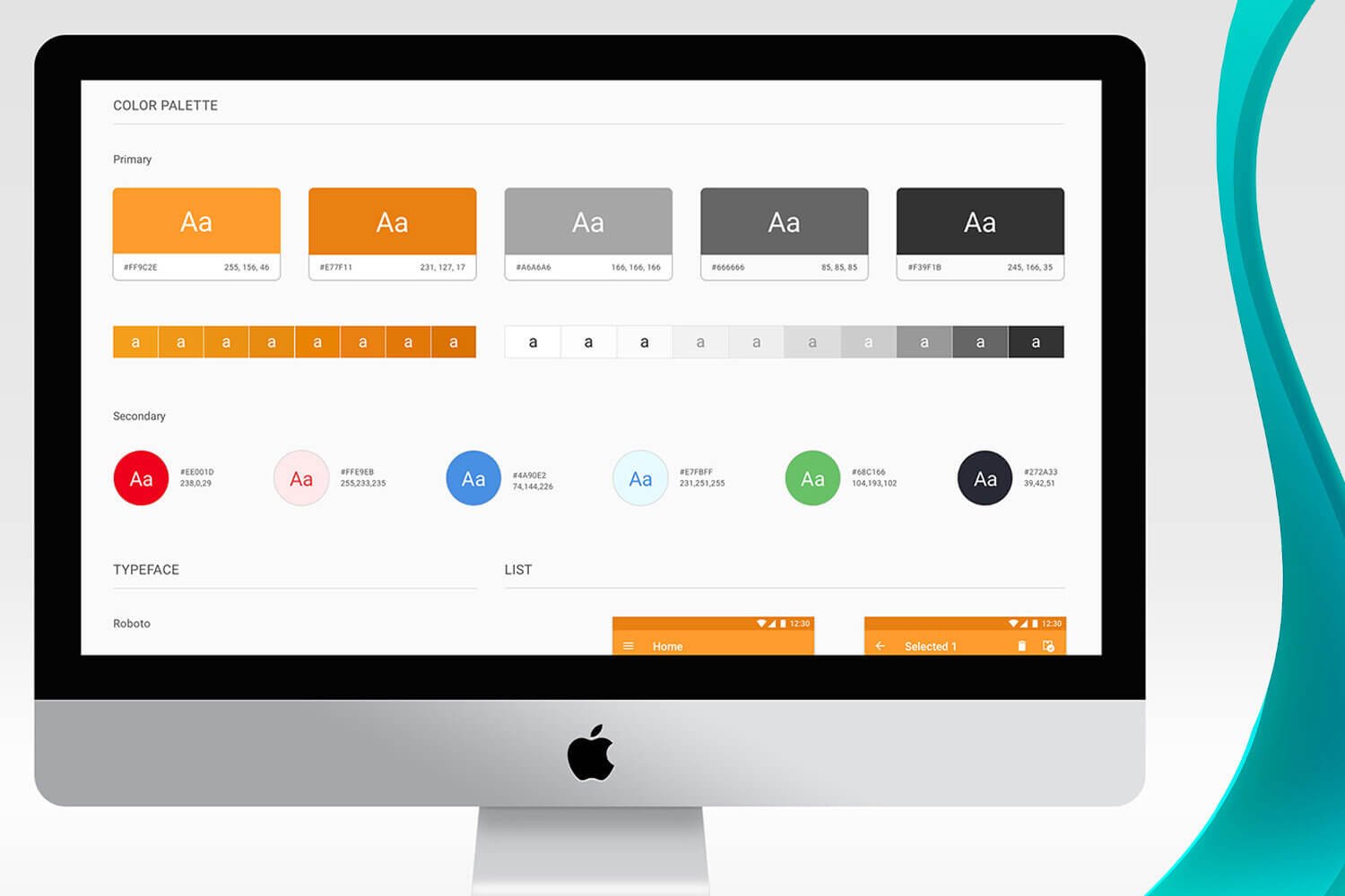
Design guidelines are a set of tools built by designers to determine accurate visual components that follow good software design principles such as intuitiveness, learnability, efficiency, and consistency in a specific product to provide a positive user experience. Additionally, they help designers, developers, and other stakeholders to apply visual consistency in every single element found in an interface in order to unify all of the components that exist in the identity of a digital product. That’s why design guidelines set up rules that include color hierarchies and style guides.
Why is it important to create software design guidelines?
The guidelines can help the software product to be easily recognized within its industry and by its users. It can also help the product look more professional and reliable, bringing value to the table, as well as a better perception from the audience.
When should the design guide be defined?
If a product needs to be redesigned, or if it’s being created from scratch, defining the design guidelines from the beginning is a great strategy for increasing the speed of the project. This is just one of the many ways that Soluntech delivers the fastest turnaround times in the industry.
What do good software design guidelines include?
Software design guidelines contain internal groups, such as:
Style (visual identity, brand, and colors)
Layout (navigation flow and interactions)
User interface components (menus, buttons, icons)
Text (typography, font size, and labels)
Accessibility (Disabled user tools)
Patterns (forms, text direction, responsiveness)
Not all design guidelines include these elements, since their relevance depends on the specific product and its current needs.
What is the impact that design guidelines have on a product in the short term?
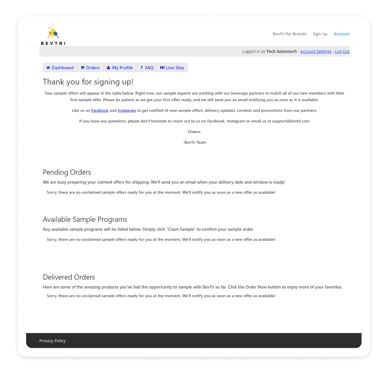
The following images show the perfect example of a digital product that uses a flat, standard design style. Once the typography, font size, text layout, and hierarchy have been modified according to improved software design guidelines, the final product is significantly improved. The improvement provides a visual rhythm that invites users to navigate the content faster since it’s easier to identify headlines from the paragraphs, pictures, and tables.
Before
After
Improvement details
The BevTri color palette doesn’t include this bright blue shown in the picture on the left that Knack suggests in their templates. Choosing a minimal style menu is a good software design choice since it helps guide the users’ eyes towards the text rather than the side menu.
Text style is a variable that affects the way readers perceive paragraphs. In this case, software design guidelines deliver a substantial improvement because the headline is not only a larger size, but it’s also in bold. This little change increases contrast and calls the user’s attention immediately. Text alignment and typography are two characteristics that also affect the final look and feel. This type of “thank you” message should be aligned to the left, rather than with the center “printed card” style shown in the left image.
Interface design must take into account the information you want to share with your audience. It’s crucial to carefully select the data that you provide to your users. It never hurts to hire an extra pair of eyes to help you use good software design guidelines to evaluate the content and add images or details that add value to your interfaces. Short sentences, photographs, tables, and strategic layout are all design tools that contribute to outstanding digital products.
Raise the bar and shoot for the moon with an out-of-this-world user interface!
Get free software design guidelines with the purchase of any of our software development packages. Offer valid until September 4th, 2020.


